Meetu v2
🔵 Meetu v2 — Reimagining Casual Communities for the Next Generation
This concept repositions Meetu as a calm, safe, and story-driven space for everyday connection.
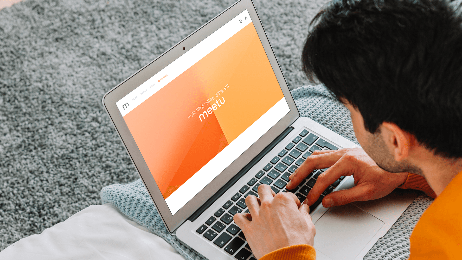
Best Rated Portfolio in the Market
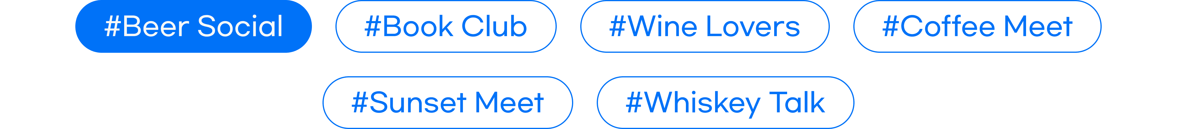
This version focuses on minimal touchpoints with maximum clarity. The visual tone is soft and breathable, using neutral backgrounds with expressive accent colors based on hobby categories (e.g., mint for wellness, lavender for creativity, coral for food). We introduced a “Story Card” layout — a scrollable experience that highlights real people, real meetups, and real moments, making the platform feel alive and personal. Micro-interactions, subtle animations, and a warm onboarding flow guide the user into a journey that feels like an invitation rather than an app.

Too Many Platforms, Not Enough Intimacy
This version focuses on minimal touchpoints with maximum clarity. The visual tone is soft and breathable, using neutral backgrounds with expressive accent colors based on hobby categories (e.g., mint for wellness, lavender for creativity, coral for food). We introduced a “Story Card” layout — a scrollable experience that highlights real people, real meetups, and real moments, making the platform feel alive and personal. Micro-interactions, subtle animations, and a warm onboarding flow guide the user into a journey that feels like an invitation rather than an app.


A Calm, Frictionless Way to Join or Host Meetups
Meetu v2 offers a gentler social experience, where users are encouraged to explore by interest, not algorithm. We prioritized clear hierarchy, fast entry points (via tags & locations), and a welcoming visual tone to ease hesitation. Hosting a meetup is now just three steps, and joining one feels like being invited, not applying.

Simplicity, Emotion, and Purposeful Flow.
Visual Softness: Neutral tones with playful accent colors to reduce interface anxiety
Human Layouts: Emphasis on real people over icons or abstract graphics
Contextual UX: Suggestions based on location, time, and vibe — not just keywords
Inclusive Typography: Rounded sans-serif fonts, larger sizes, and strong contrast for accessibility
Personal Onboarding: First questions focus on “how you feel,” not “who you are”